What we look at in markets each month: the macro analysis map
Educational content. The monthly analysis reads what has already happened and the current regime; it contains no forecasts or recommendations. Data come from public sources (FRED, ECB, Eurostat). Past performance does not guarantee future results.
Not "where the market is going", but "where we are"
Every month we publish a markets update. It doesn't promise to guess the future: it captures the present in a structured way, because most mistakes come from reading a single data point (equities rising) while ignoring what other markets signal underneath. Here we explain the five lenses we use.
The five lenses
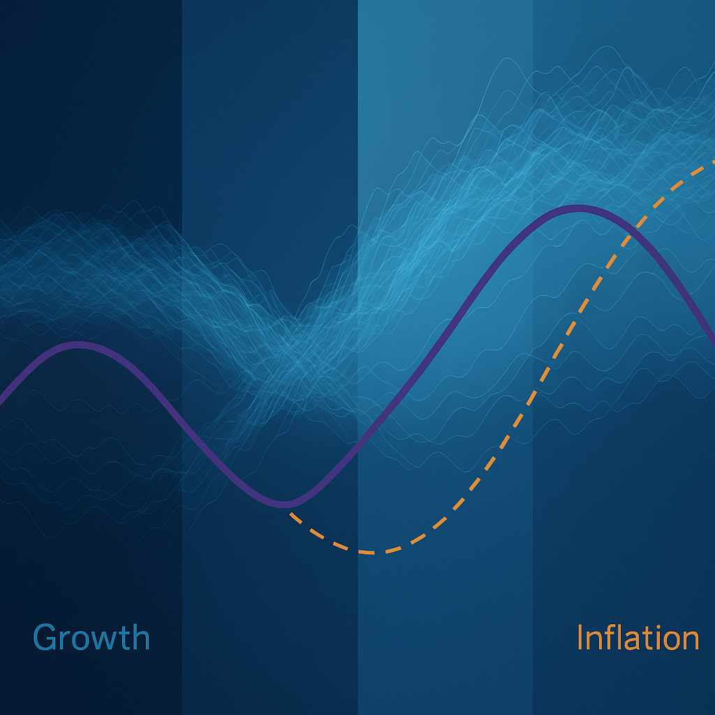
1. Macro compared — growth, inflation, real rates. The point isn't the isolated figure but the comparison. Real example (May 2026): the US with real GDP ~+2.6% and core inflation ~2.7% while Fed Funds stay higher (~3.6%) → positive real rates without recession. Europe instead: growth ~+1% but inflation ~+3% with ECB deposits at 2% → the textbook calls this creeping stagflation. (Real rate ≈ nominal rate − inflation.)
2. The regime and the yield curve. The spread between the 10-year and 2-year yield is the barometer. An inversion (10y < 2y) historically precedes recession; a return to parity (example May 2026: spread ~0.00%) signals a regime shift: extending duration is no longer rewarded.
3. Geographic rotations. We compare indices by region (1-year performance). Example: S&P 500 ~+24.7% vs MSCI Europe ~+5.8%. But the number must be contextualized (currency, sector composition).
4. Sector rotations. Who leads and who lags, and at what risk price — looking at sector Sharpe and the level of the VIX. A sector Sharpe that "defies statistics" is a sign of concentration, not just strength.
5. Risk implications. The "so what?": with a flat curve, active duration management loses power as a source of alpha, and attention shifts to credit selection or barbell strategies.
The metrics, one line each
- Real rate = nominal − inflation: how much monetary policy really bites.
- Curve spread (10y−2y) = cycle tension: inversion → recession fear; flat → regime shift.
- Sharpe = excess return per unit of volatility.
- VIX = expected volatility: the "fear thermometer".
- Currency-adjusted performance = an honest comparison across regions with different currencies.
A note on method
We always read past/present, never as a certain forecast; we use public data (FRED, ECB, Eurostat, ISTAT) and compare it rather than isolate it. It's the same rigor we apply to models — see the portfolio metrics.
Sources
FRED (St. Louis Fed) · ECB · Eurostat · ISTAT.
Educational content, not advice or a recommendation. Past performance does not guarantee future results.