Building a Well-Diversified ETF Portfolio
Introduction
The objective of this analysis is to show how to compose a diversified and efficient ETF portfolio, eliminating redundant exposures and maximizing the risk/return ratio. We will start from a broad set of ETFs covering various economic sectors, asset classes (equities, bonds, commodities) and geographic areas, and then use quantitative tools (correlations and hierarchical clustering) to reduce unnecessary overlap. In other words, we will seek to understand which ETFs are truly necessary to achieve optimal diversification and how these financial instruments relate to each other statistically. The path we will follow reprises the content of one of my YouTube videos, enriched here with references to institutional sources and technical details useful for deepening the topic. The analysis is completely reproducible via Python code executable on Google Colab (without the need for local installations) which I will share and explain later.
Video: ETF Portfolio and Diversification – Video • Colab Notebook: Open on Google Colab
Data and ETF Categories
An ETF (Exchange-Traded Fund) is a type of exchange-traded investment fund and passive management that is designed to replicate the performance of a market index.(Wikipedia) In practice, through a single ETF it is possible to invest in a diversified basket of assets (stocks, bonds, etc.), obtaining broad exposure with a single operation. ETFs available on the market are divided into various categories, for example by sector, geographic area or type of investment (equities, bonds, commodities). In our dataset we consider a set of 27 very heterogeneous US ETFs, with information for each such as ticker (symbol), TER (total expense ratio), market capitalization, ISIN code, reference broker, sector, asset class, income distribution policy (accumulating vs. distributing with quarterly or monthly frequency) and the index replication methodology (physical sampling, synthetic, etc.). Most of these funds are sector equities, but bond ETFs, commodities ETFs and regional equity market ETFs are also included.
For clarity, here are the main categories of ETFs in the dataset:
- Equity: funds that invest in baskets of equities. They can focus on specific sectors (e.g. technology, energy, financial, healthcare, consumer staples, utilities, etc.) or geographic areas (e.g. MSCI Europe, MSCI EM emerging markets, MSCI EAFE for developed markets outside the US, etc.).
- Fixed Income: funds that invest in fixed-income securities. In the dataset we find ETFs on US Treasury Bonds of various maturities (short 1–3 years, medium 7–10 years, long 20+ years), corporate investment grade bonds, high yield bonds (speculative grade), and emerging market sovereigns. There are also inflation-linked bonds and convertible securities ETFs.
- Commodities: funds that follow commodity markets. For example, a physically-backed gold ETF, and some ETFs linked to baskets of agricultural or energy commodities (futures contracts).
- Multi-asset/Other: includes instruments that do not fall neatly into the above categories. For example, in the dataset we have a balanced convertible securities ETF (which combines equity and bond characteristics).
This rich dataset allows us to analyze very different investments. Each row of the dataset represents a specific ETF and, thanks to the variety of asset classes and sectors covered, we can study how each ETF behaves relative to the others in terms of return correlation. The starting hypothesis is that it is not necessary to hold all these ETFs at the same time: some may prove redundant, moving very similarly to others. By identifying these overlaps, we can simplify the portfolio while retaining only the ETFs that provide a real diversification benefit.
Correlation Analysis

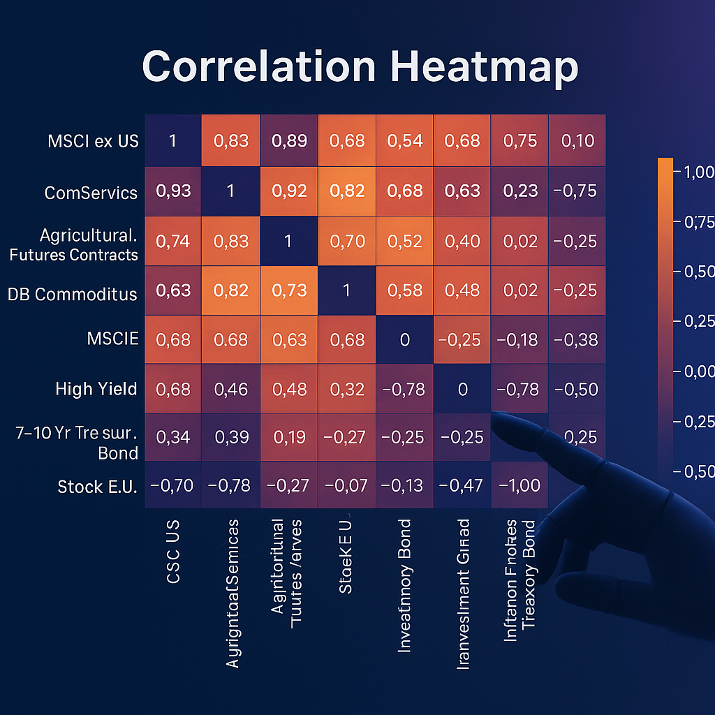
As a first step, we calculate the correlation matrix between the returns of the various ETFs, visualizing it in the heatmap of Figure 1. Correlation measures the similarity between two return series: it ranges between −1 and 1, where values near 1 indicate that two ETFs move almost in unison (perfect positive relationship), while values close to −1 indicate they move in opposite directions (inverse relationship). Values around 0 denote an absence of linear relationship. In our case we see correlations ranging from a maximum of about +0.99 (almost perfectly positive) to a minimum of about −0.35 (moderately inverse). This latter extreme corresponds to the correlation between the very long-term US Treasury Bond ETF (20+ years) and the Financial sector ETF: this means that historically, when long-term government bonds rose, financial stocks tended to fall, and vice versa. This reflects known dynamics of flight-to-quality: during periods of economic uncertainty or market turbulence, investors often abandon riskier equities and move into assets considered safer such as Treasury bonds, causing the latter to rise in price while equities fall.(PIMCO)In fact, on a general level, the correlation between the equity and bond markets tends to be low or negative during periods of macroeconomic stability (low inflation around 2%): this allows these two asset classes to balance each other in a portfolio, reducing overall volatility for the investor.(PIMCO)
We also observe that other bond ETFs (in particular those on Treasury bonds of various maturities) show negative or near-zero correlations with equity ETFs. Quantitatively, over long horizons, the correlation between government bonds and equities has been close to zero (e.g. 2000–2020 ~0.11 between the global Treasury index and the world equity index), while High Yield is much more correlated with equities (often ~0.7–0.8). (Janus Henderson)
Another interesting aspect emerging from the heatmap is the role of gold. The gold ETF shows virtually zero correlation with equity ETFs and only slight positive correlation with Treasuries and inflation-linked bonds: this confirms the role of a safe haven and useful diversifier, providing protection during extreme market events. (State Street / World Gold Council via WSI)
Hierarchical Clustering to Eliminate Redundancies

1 − correlation). Colors highlight clusters when cutting the tree at threshold 0.14.The correlation matrix (27×27) is dense; hierarchical clustering groups the ETFs based on the similarity of their movements using the distance dij = 1 − ρij. Reading the dendrogram, for example MSCI Europe and MSCI EAFE are joined at almost zero distance (correlation ~0.99). Developed geographic ETFs form a cluster; emerging markets are further away. Healthcare and Consumer Defensive appear joined at low distance (defensive sectors). Gold remains isolated at the top (maximum diversification). Treasuries of various maturities form a distinct group from equities. To select a lean set, you can cut the tree at 0.14 (≈ correlation 0.86) and keep only one representative ETF per cluster (the one with the best historical return). “Cluster-based” selection approaches are also proposed in the literature to improve diversification with fewer securities. (Stevens Institute of Technology)
Return and Risk of Selected ETFs
After eliminating duplicates, we evaluate for each ETF the compounded annual return, volatility, Sharpe ratio and max drawdown. At the top we often find Technology (highest returns but also high risk): an “offensive” engine that can suffer sharp drawdowns in negative phases. (AllianceBernstein). Healthcare shows solid return with more contained volatility: a defensive sector that tends to protect in difficult times (AB). On the bond front, High Yield historically has interesting returns with volatility lower than stocks, but high correlation with equities (~0.7–0.8), thus less diversification power in crises (Janus Henderson). Treasuries have more modest returns, but low/negative correlation with risk assets and therefore reduce overall portfolio risk (PIMCO). Gold adds decorrelation and improves risk-adjusted returns on large portfolios (WGC/SSGA via WSI).
Reproducing the Analysis with Google Colab
A key part of this project is the ability for anyone to replicate the analysis and customize it, using the Python code available in a Google Colab notebook. Google Colab is an online platform that allows you to execute Jupyter Notebook code directly in the browser, without installing anything on your PC, leveraging cloud resources.
- Accessing the notebook: open this Colab link. You will find ready-to-use code and text cells.
- Importing libraries: run the first cells (pandas, numpy, matplotlib, scipy, utility functions).
- Loading the data: the metadata table (ticker, TER, sector, etc.) is read from file; check the preview.
- Historical prices: load the price series; you can extend or shorten the horizon (e.g. 1–10+ years) by modifying the parameters.
- Price vs. Total Return: didactic chart with reinvested dividends for a chosen ETF.
- Correlations: calculation and heatmap of returns (daily or monthly).
- Hierarchical clustering: parameter
distance_threshold(e.g. 0.14 ≈ correlation 0.86) to define clusters; automatic selection of the best ETF per cluster. - Visualizations: metric tables and interactive Plotly graph (returns vs volatility).
Conclusions
In this study we demonstrated a data-driven approach to constructing a well-diversified ETF portfolio. Starting from a heterogeneous set of funds, correlations and clustering highlighted exposure duplications. Eliminating them leaves a more restrained selection in which each ETF plays a distinct role (equities for regions/sectors, government and corporate bonds, gold, etc.). The key is to balance defensive components (gold, Treasuries) and offensive ones (tech, high yield) according to your profile.
Often you don't need to hold dozens of ETFs: it is more effective to choose a few well-targeted funds that cover truly complementary areas. In future insights we will start from this shortlist to address the topic of optimal weights.
Questions or doubts? Try the notebook, experiment and write to me. And if you prefer the video format, here is the complete tutorial on YouTube.
Sources
- Wikipedia – Exchange-Traded Fund (ETF): it.wikipedia.org
- PIMCO – Negative correlation between equities and bonds: pimco.com
- State Street Global Advisors / World Gold Council – Gold as a safe haven: wallstreetitalia.com
- AllianceBernstein – Technology vs Healthcare: alliancebernstein.com
- Janus Henderson Investors – High Yield vs Equities/Treasury: cdn.janushenderson.com
- Stevens Institute of Technology – Clustering and portfolios: fsc.stevens.edu