The engines
Welcome to AlphaFrame. Before we show you a single performance number, we owe you an answer to a more basic question: what are these models, actually? That is the whole job of this first episode. It is the foundation. Every later episode opens with a one-slide recap of the engine it discusses, so you can always place it back in the map we build here today.
Here is the honest contract we work under, and we will not break it. We will tell you what each engine invests in, described by asset class or sector, and we will tell you its character, whether it is balanced, aggressive, or defensive. That is the universe and the character. What we will never show is the recipe: not the exact holdings, not the internal settings of the networks, not the training details. Family and discipline, never the ingredients.
Why does that matter? Because a return figure means almost nothing on its own. A number that came from an aggressive engine that can lose more than half its value in a crisis is a completely different animal from the same number produced by a quiet defender. Same headline, opposite risk. If you do not know what produced the return, you cannot judge whether you would want to live with it.
So think of what follows as a tour of a park of engines. There are several of them, each built for a different job, and we are going to walk you through the whole park before we ask any of them to prove itself. We will be concrete, we will be plain, and where the evidence is weak we will say so out loud. Let us start by making sure we all mean the same thing by an ETF allocation model.
What an ETF allocation model is
Let's start from the ground up, because the whole series rests on this. What is an ETF? It's an exchange-traded fund: a single, low-cost basket that tracks a slice of the market — say, a stock-market index, one economic sector, or a group of bonds. You buy one thing and you own a whole basket, cheaply. That's the raw material we work with. Now, an allocation model. Think of it as the hand on the dial. It doesn't pick winners one stock at a time; it decides how much of your capital sits in each ETF — the weights — and, crucially, it changes those weights over time as the world changes. More in one basket this month, less the next. That "how much, and when to shift it" is the entire job. We don't run a single model. We run several, and each has a different job — one built to be balanced, one to be aggressive, one to defend, plus simpler rule-based strategies. You'll meet each of them in the coming slides, so for now just hold the idea: a park of engines, deliberately different. One more thing, and we'll repeat it often because it matters. Every number we show you is net. Net of the twenty-six percent Italian capital-gains tax, and net of the real trading costs of moving money between baskets. Gross returns are easy to advertise and easy to inflate; they're not what lands in your account. So when we say a model returned a certain figure, that's after the tax and after the frictions. It's the honest number, the one you'd actually keep. Keep that lens on for the rest of this episode.
The engines at a glance
So here is the whole park, sorted into three families. Think of this slide as the map; the next several slides walk each engine one at a time.
The first family is our main deep-learning research models. There are three of them, and we call them Model3, Global, and Permanent. “Main” means they are the more mature research engines of the series, not experiments (and they remain in-sample, not yet validated out-of-sample). Each is an LSTM network with attention — a neural network with memory that learns to spread capital across a basket of ETFs — and each has a deliberately different job. Model3 is the balanced all-rounder. Global is the aggressive one. Permanent is the defender. We will see exactly what those characters cost and earn in the next three slides.
The second family is the candidates. These are newer deep-learning ensembles, still in testing, built to be judged later — not trusted yet. We are honest about that: they are promising but unproven, and a fixed decision date tells us whether to keep them.
The third family is the mechanical strategies. These are rules, not learned models: a cross-sectional momentum strategy that holds whatever has been strongest, and an Investment Clock that reads the macro world into regimes. Alongside them sits a bond momentum sleeve — the same idea applied to a basket of bond ETFs. Rules are transparent; there is nothing hidden to overfit.
The recap table on the right gives you, for every engine, the same three columns: its universe described by asset class or sector, how it is built, and its character in one word. That is all we ever disclose — universe and character, never the recipe. Keep that table in the corner of your eye; every later episode opens with it.
Model3 — the balanced all-rounder
Let's start with Model3, the balanced all-rounder. Its universe is US equity sectors, plus gold and long-dated Treasuries. Think of it as an all-weather engine: it is not built to win any one environment, it is built to keep working across all of them. Over the full sample, its compound annual growth rate is 23.5% net of tax, with a maximum drawdown of minus 45.1%, and a correlation to the US market of 0.78. That correlation number matters: at 0.78 it moves broadly with equities, so it is not a hedge, it is a participant that tilts. Now, where does it actually earn its keep? We break the history into four macro regimes, defined by whether growth and inflation are rising or falling. Model3 leads in Recovery, where it compounds at plus 28.3% a year, and in Reflation, at plus 25.0%. It holds up in Stagflation at plus 20.6%. Its weakest patch is Overheat, at plus 14.2% — still positive, just the bottom of its own range. And here is the point we want you to take away: it has no single best regime. There is no environment where it is the star and no environment where it collapses. It is the steady middle of the park, the engine you lean on when you do not know which world is coming next. One honest caveat, the same one that applies to all our main research models: these figures are in-sample, the model was trained on this history. So read them as evidence of character and shape — a balanced, market-following, all-weather profile — not as a forecast of future returns.
Global — the aggressive engine
Now the opposite temperament. If Model3 is the steady middle, Global is the aggressive engine of the park. Its universe is deliberately wide: global equities — the United States, Europe, and emerging markets — plus a broad aggregate bond position and gold. So it reaches for growth wherever the world is expanding, and it does not hold back. We call it high-beta, which just means it amplifies the market: when markets rise, it tends to rise more, and when they fall, it tends to fall harder. The full-sample numbers tell that story plainly. The compound annual growth rate is 23.2% net of the 26% tax — right alongside Model3 on return. But look at the cost of getting there. Global carries the deepest drawdown of the entire park: a peak-to-trough loss of minus 55.7% in 2008. A drawdown is simply how far you fell from your previous high before recovering, and this is the largest wound any of our engines took. It was also the worst crisis defender we have: in that 2008 collapse it lost 55.7%, only a little better than the market's own minus 60.6%. Its correlation to the broad US market is 0.73, higher than the defender we will meet next, and that number is the whole personality in one figure — it moves closely with equities, for better and for worse. So the honest way to read Global is this. It rides expansions hard and rewards you when the cycle is running; it suffers most when that cycle breaks. That is not a flaw to be fixed — it is the job. And, as with every research curve in this series, these figures are in-sample, so read the character and the risk, not a promise. Next we turn to the engine built for the exact opposite moment.
Permanent — the defender
Our third main research engine is Permanent, and its job is the opposite of the last one. Where Global rides the expansion and pays for it in the crash, Permanent is built to survive the crash. Its universe is a permanent-portfolio core: equity for growth, gold as an inflation and crisis hedge, long-dated Treasuries for the deflation shock, and cash for dry powder. Four assets that tend not to fail at the same time. That is the whole idea. The character is defensive and, above all, decorrelated. Of the entire park, Permanent has the lowest correlation to the market, just 0.54, which means when the market lurches, this engine only half follows. And it shows exactly where it matters most, in a crisis. In 2008, when the market fell about 60.6%, Permanent gave back only 32.7%. In the COVID crash, the market dropped 34.3%; Permanent, just 17.4%. Roughly half the pain, both times. That is not luck; it is the gold and the Treasuries doing their job when equities break. But there is no free protection, and we will not pretend there is. The price Permanent pays is in Stagflation, high inflation with weak growth, where it is the weakest of the family at plus 9.7% a year. Its full-sample return, at 18.6% net, is the lowest of the three main research models, and its drawdown is the shallowest. That is the trade, stated plainly: Permanent gives up upside to buy protection. It will not win the good years. It is there so the portfolio is still standing after the bad ones. And, as always, these curves are in-sample, so read the character, not a promise.
The candidates (in testing)
Those three engines are where our research is focused today — in-sample, not yet validated out-of-sample. Now meet the challengers: the candidates. These are newer deep-learning allocators — again, LSTM networks with attention that spread capital across ETFs — but built on the global universe you just saw, the one spanning US, European and emerging equities, aggregate bonds and gold. The twist is that we don't lean on a single model. We combine several random seeds — several separately initialised versions of the same architecture — and average their behaviour, so no one lucky run drives the result. And we run them in two variants. One reads a live macro-rate signal, a read on interest rates; we call that curve-ON. The other is deliberately feed-independent — it never sees that signal — and we call it curve-OFF. Same skeleton, one difference: whether the model gets to lean on the rate environment or has to stand on price alone. Here is the honest part. These are not among the main models. They are in TESTING, and we have pre-registered a decision gate — a rule written down in advance — for December 2026, judged on clean out-of-sample data the models have never touched. Written in advance so we can't move the goalposts after we see the answer. So far, curve-OFF shows the best risk-adjusted profile of the two: a Calmar ratio of 0.61 — return measured against worst drawdown — and a Sharpe of 1.09 — return measured against volatility. Encouraging, but only that. We say it plainly: the candidates are fragile and unproven. Averaging seeds helps, but small changes still move them, and a good backtest is not a promise. We are not selling them. We are testing them. In December, the gate decides — pass, and one may join the park; fail, and we say so out loud.
Mechanical strategies (TIER 2) — the picture
Now the mechanical strategies — and this first one is a cautionary tale, on purpose. It is rules only. No training, no random seeds, nothing learned. We rank clusters of ETFs — equities, bonds, commodities — by their recent momentum, that is, by how strongly they have been trending upward. We hold the strongest clusters, and we rebalance on a fixed schedule. That is the whole recipe: buy what has been going up, and refresh the list at regular intervals. The appeal is obvious. Momentum is one of the oldest, most documented patterns in markets, and here there is nothing to overfit — a machine could not quietly memorise the data, because there is no learning step at all. And on the full history it looked strong: roughly plus fourteen point four percent a year, gross, since 2006. That is a headline number most people would happily take. But here is where our method earns its keep. When we ran this same strategy through our honest train, test, and validation gate — three separate slices of time, judged independently — it failed. The reason is specific: its edge was not spread evenly across the whole period. It was concentrated in the most recent block. In plain terms, the strategy that looked so convincing on the full window was really riding one favourable stretch, not a durable, repeatable advantage. So why keep it in the park at all? Precisely because it teaches the lesson this whole series is built on. A single, impressive, full-sample number can be an illusion. A strategy can look excellent on paper and still collapse the moment you ask it to prove itself out of sample. This one is our clean example of exactly that gap — good on the full window, but it does not survive the gate.
TIER 2 at the gate — validation is the tell
Our second mechanical strategy takes a very different angle. Instead of ranking ETFs by their own recent strength, the Investment Clock reads the macro world and asks a simpler question: what kind of economy are we in right now? It sorts the world along two axes — growth and inflation, each either rising or falling — which gives four regimes. And in each regime, it holds the sectors that historically fit that phase, then rotates as the picture changes. It is macro logic turned into a rulebook. Historically it earned roughly plus sixteen point three percent gross, a touch stronger than the momentum sleeve we just discussed. And here is the part that matters: unlike the pure momentum strategy, this one passed our honest gate — three blocks out of three, measured against a standard sixty-forty benchmark of stocks and bonds. So on the face of it, the regime idea survives the test that momentum failed. But we owe you one explicit caveat, and it is a real one. The weights it uses — how much to hold in each sector in each regime — were tuned on the whole sample, without a proper hold-out set aside in advance. In plain terms, the model got to see the answers while it was being tuned. That does not erase the result, but it does weaken it. The evidence here is genuinely thinner than for the deep-learning models, where selection was strictly out-of-sample. So we place the Investment Clock in an honest middle ground: a strategy with real economic reasoning behind it, that cleared the gate, but whose fitting was not as disciplined as we would like. Promising, passed, but caveated — and we would rather tell you that than dress it up.
The bond sleeve
Now the bonds. So far we've talked about equity engines and defenders; this sleeve does something narrower and, frankly, more modest. It applies a textbook rule to fixed income: take a basket of US bond ETFs — Treasuries, corporate credit, emerging-market debt, and mortgage-backed bonds — measure which have the strongest recent momentum, buy the top three, and rebalance once a month. Momentum here just means recent relative strength: we let the segments that have been performing lead, and we quietly rotate out of the ones that have been lagging. No training, no neural network, no random seeds. It is a fixed rule you could write on an index card. And that simplicity is the point, because it means there is almost nothing to overfit. The intuition is plain: within bonds, the segment that has been outperforming — say credit over Treasuries in a calm year, or Treasuries over credit when stress hits — tends to keep leading for a while, long enough for a monthly rule to catch it. Now the honest part, the part that matters. Unlike the mechanical equity momentum we just saw, this one PASSED our gate — and it passed on all three blocks, not just the lucky recent stretch. Net of the 26% tax, it added roughly one-and-a-half to two-and-a-half percentage points a year over a simple aggregate bond index. That is not a headline number, and we're not going to dress it up as one. But it is consistent, and it survives the same test that failed the equity momentum sleeve. So here is the plain verdict: of everything new the programme produced, this is the one genuinely deployable sleeve — the one we would actually put to work.
Production core — cumulative wealth
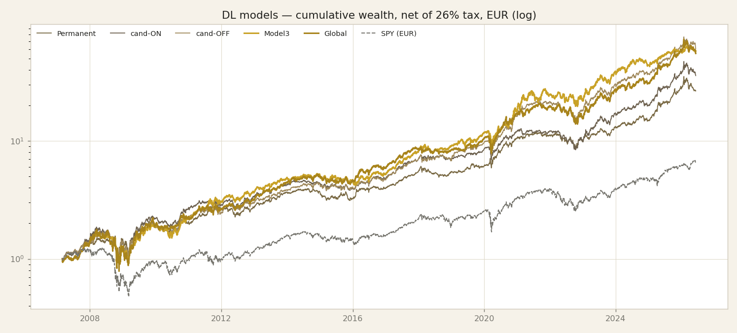
This is the chart most people skip to first, so let us read it slowly and honestly. What you are seeing is cumulative wealth: one euro invested at the start, compounded forward over roughly nineteen years. It is net of the twenty-six percent Italian capital-gains tax and net of real trading costs, quoted in euro, and drawn on a log scale. The log scale matters: on a log axis a straight line means a constant growth rate, so equal vertical steps are equal percentage gains, not equal euro. That is the honest way to compare things that compound. On this chart the deep-learning allocators — the LSTM networks with attention that spread capital across a basket of ETFs — compound well above a passive S&P benchmark held in euro. The lines climb higher and, just as important, their shape is steadier through the rough patches. Now the caveat we owe you, stated plainly. These research curves are in-sample. That means the models were trained on the very same history you are looking at, so they have, in a sense, already seen the answers. Read the shape and the risk — how deep the falls go, how the curve behaves in a crisis — but do not read the exact levels as a forecast, and never as a promise of future returns. An in-sample curve tells you a strategy's character; it does not tell you what next year holds. This is precisely why the candidates and the gate exist. They are our defence against fooling ourselves — a way to test engines on data they have never touched, so the numbers we eventually trust are earned out-of-sample, not admired in-sample. Keep that distinction in mind for every curve in this series.
The alpha curve — beating the index over time
Here is the single most useful chart for monitoring an engine: the alpha curve. It is simply each model's cumulative wealth divided by the index's — the S&P in euro. The dashed red line at one is parity: on it, you match the index exactly; above it you are beating it, below you are trailing. And the slope is what matters day to day — while the line rises the engine is adding value over the index, when it flattens or dips it is giving some back. Read across nineteen years and the story is clear: every line climbs well above parity — Model3 and Global to roughly ten to twelve times the index's wealth, the defender Permanent and the candidates to a milder three-to-six times, which fits their calmer character. Look at the shape, not just the endpoint: the curves step up hard in 2008 and 2009, and again in 2020 and 2022 to 2023 — the engines add most of their edge precisely when the index is struggling, which is exactly where an investor wants it. This is the view we would watch live to catch trouble early: a curve that stops rising is the first warning that an edge is fading. Two honest reminders. These research curves are in-sample, so the levels are flattered — read the shape, not the exact height. And the rigorous, out-of-sample version of this — the distribution of the alpha, block by block, through the gate — is the whole subject of the method episode that comes next.
Year by year
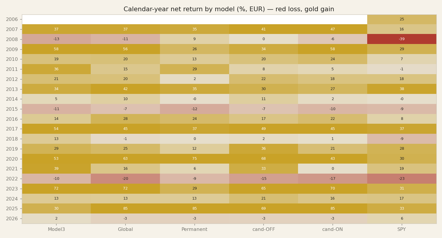
Now the output that matters most to you: performance, period by period. This heatmap gives every calendar year for every engine, net of tax, in euro — red is a losing year, gold is a winning one. Read it two ways. Across a row you see one year lived by all the engines at once; down a column you follow a single engine's journey. Look at 2008, the great crash: the market lost thirty-nine percent, deep red — but Permanent, the defender, actually finished the year up nine percent, and Model3 and Global lost only ten to thirteen. That single row is the whole argument for a defensive engine. Now look at 2020 and 2023: almost everything is gold, Permanent up seventy-five, the models up fifty to seventy — the good years compound hard. And 2022, the difficult year: everyone is in the red, but the models lost far less than the market's minus twenty-three, with Model3 down only ten. Notice what you do NOT see: no engine is gold every single year. That is normal and honest — the edge is not winning always, it is losing less when it is red and compounding when it is gold. One reminder we will not drop: these are in-sample years for the main research models, so read the pattern and the risk, not the exact figure as a forecast.
Performance across time windows
The same models look different depending on the window you measure — and that is a lesson in itself. This table shows the net annual return over the last one, three, five and ten years, and over the full nineteen. Read across a row and you see how unstable a single number is: Model3 shows ten percent over the last year but twenty-eight over ten years; Global shows twenty-nine over one year. Over the full sample the deep-learning models compound around twenty-three percent a year net, against roughly eleven for the passive S&P in euro — but shrink the window to five years and the gap narrows, and one year is essentially noise. This is exactly why, in a later episode, we warn so hard against cherry-picking a window: give me the freedom to choose the period and I can make almost any strategy look brilliant or terrible. The honest habit is to read several windows at once and trust the longest, most complete one — while remembering that even the full sample here is in-sample for the main research models. No single figure is the truth; the distribution across windows is closer to it.
The shape of risk — drawdowns
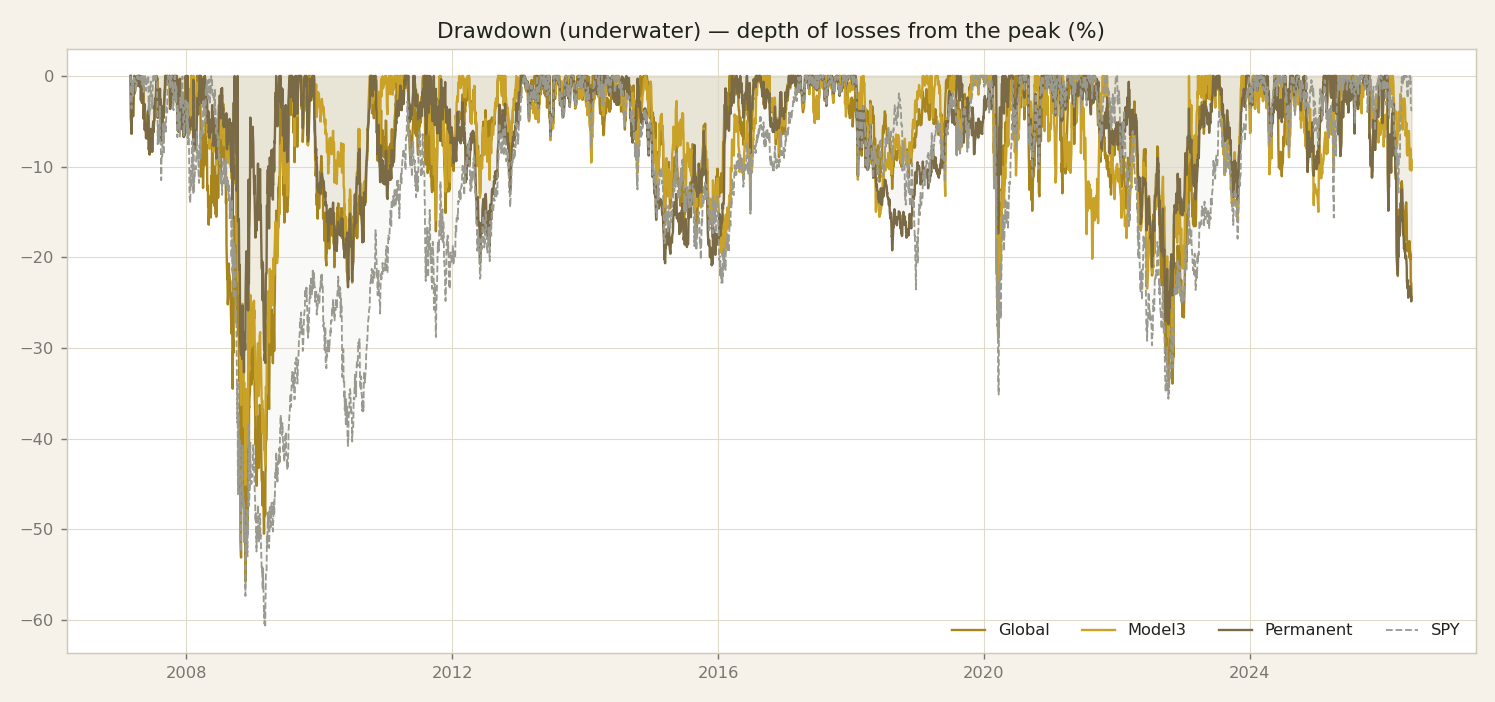
Returns are only half the story. The other half is this: how deep do you fall, and how long do you stay underwater? This chart plots drawdown — the loss from the last peak — through time, and it is the risk you actually have to live through as an investor. The market line dives deepest, minus sixty-one percent in 2008. Global, our aggressive engine, is not far behind at minus fifty-six — it earns its returns by taking real pain. Model3 sits around minus forty-five. And Permanent stays shallow, minus thirty-three, its underwater stretches both smaller and shorter — you can see the defender's signature in the shape of the line. Here is why this matters more than any single return number: an engine that returns twenty-three percent a year with a fifty-six percent drawdown is a completely different product from one that returns the same with a thirty-three percent drawdown. Most investors cannot actually hold through the deeper one — they sell at the bottom. That is why, from the next episode on, every engine is judged on its drawdown just as strictly as on its return.
How they are built — deep learning
So how are these deep-learning engines actually built? High level only — and there is a reason for that, which I will come back to. Here is the honest shape of it. Each engine reads two kinds of information: prices, and macro features — the broad economic backdrop. It reads them strictly point-in-time. That phrase matters, so let me define it: point-in-time means the model only ever sees the past, never a number that would not have been available on the day it is deciding. No peeking at the future. That single discipline is what separates a real backtest from a flattering illusion. From those inputs, the engine outputs weights — how much to hold in each ETF — through an LSTM network with attention. In plain terms: a neural network with memory, that learns which moments in the past deserve more weight when it decides today. It is trained toward a risk-adjusted objective — it is rewarded for smooth, steady growth, not raw return — and, crucially, that objective is already net of the 26% Italian capital-gains tax. So the model is optimising the number you actually keep, not a pre-tax fantasy. We also give it a no-trade band: a dead zone where small drifts in the target weights do not trigger a trade. That stops it churning — trading for the sake of trading — which would only rack up tax and costs. And selection is out-of-sample: we choose the winners on data the model never trained on. Now, what we never show. Not the exact tickers. Not the network internals. Not the hyperparameters, not the loss function, not the live weights. That is deliberate, and it is the honesty contract from slide one: we show you the family and the discipline — never the recipe.
How they are built — mechanical & regime
Slide twelve showed you the deep-learning recipe at a high level. This slide is the opposite philosophy, and that contrast is the whole point. Where the neural networks learn their weights from data, the mechanical sleeves do not learn anything at all. They are fixed rules, written down in advance. The momentum sleeves work like this: buy recent strength. You rank a set of ETF clusters — equities, bonds, commodities — by how they have performed lately, you hold the strongest, and you rebalance on a calendar, monthly or quarterly, on a fixed schedule. That is it. No training. No random seeds. Nothing that adapts to the past in a way you cannot see. And that is exactly why we trust them differently: there is almost nothing to overfit. When a rule is this simple, it cannot quietly memorise the history and flatter itself. What you see is what it does. The Investment Clock is a different kind of tool, but the same transparent spirit. It is macro logic, not machine learning. You classify the economic world along two axes — growth and inflation — into a small number of regimes, and in each regime you hold the sectors that historically fit it. Rising growth, hold the parts of the market that like growth; rising inflation, tilt toward the assets that cope with inflation. It is a rulebook you can read and argue with. So we have two families with genuinely different personalities: opaque, powerful, data-hungry networks on one side, and plain, legible rules on the other. Different tools for different jobs. But — and this is the discipline that holds the whole series together — none of that difference earns any of them a free pass. We judge every one of them, the networks and the rules alike, by the same honest gate. That gate is the next episode.
The character map
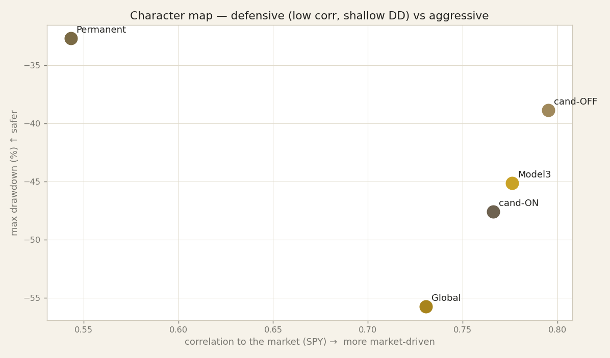
This is the picture that ties the whole park together. One scatter plot: along the horizontal axis, how closely each engine moves with the broad market; up the vertical axis, the worst peak-to-trough loss each one ever suffered. Two numbers, one dot per engine, and suddenly the personalities we described one by one become a map you can read at a glance.
Look at the corners. Permanent sits off on its own — the lowest correlation to the market, 0.54, paired with the shallowest drawdown. That is the genuine defender, the engine that goes its own way when everything else moves together. Now look at the opposite corner: Global, high correlation, and the deepest wound of the whole park, minus 55.7 percent. That is the aggressive engine, tightly bound to the market, and it pays for that ride in the worst moments. The two of them anchor the extremes.
In between, the crowd. Model3 and one of our candidates, cand-ON, cluster in the market-driven middle — respectable, steady, but their fate is broadly tied to equities. And standing a little apart on the quality of its risk-adjusted profile is cand-OFF, the feed-independent candidate, which so far shows the best return-per-unit-of-pain in the group — though remember, it is still in testing, and the December gate decides.
Here is why the map matters more than any single dot. If every engine sat in the same corner, we would just have one bet dressed up five different ways. Instead they occupy different corners: distinct, complementary personalities. That separation is not decoration — it is the entire thesis of this park. Different corners mean different behaviour in the same storm, and that is what lets a portfolio of them stand steadier than any one alone. We prove that claim in the regimes episode; for now, read the map as the shape of the argument.
Global — how its mix moved over time
Let's make allocation concrete with one engine — Global, the aggressive one — and watch its asset-class mix move through time. The copper band is equity; the gold band is gold, the metal. Over the full period Global averages about two-thirds equity and a full third gold — but that average hides the real story, which is that this engine rotates, and rotates with conviction. In the years around the 2008 crisis it leaned heavily on gold — you can see the gold band dominate the left of the chart — using the metal as a store of value while equities were dangerous. Through the long bull market of the 2010s it sat mostly in equity, the copper filling the panel. Then look at 2019: it swung hard back into gold, equity dropping to barely fifteen percent, before rotating into stocks for the 2020-to-2023 rally — and in the most recent stretch the gold sleeve is widening again. That is what 'aggressive' actually looks like under the hood: not reckless, but decisive — big, conviction-sized shifts between the growth engine, equity, and the safe haven, gold. Two honest reminders, the same as always: this is by asset class, never the individual holdings, and it is the history, not today's positioning — the current book shifts, and if that is what you need, get in touch. On the next slide we line up all three engines' mixes in a single fingerprint table.
The fingerprint of the mix
Turn that behaviour into a few numbers per engine and you get its fingerprint. First, average exposure by class. Model3 is equity-heavy — about eighty-five percent — with small gold and bond sleeves. Global is two-thirds equity and a full third gold. Permanent is genuinely balanced across equity, gold and bonds, with a touch of cash. That balance is the source of Permanent's defence — and also its cost, the weak Stagflation we saw earlier. The second number is turnover: how much of the book it rotates in a year. It matters more than it looks, because, as the fiscal episode will show, turnover IS tax — every rotation of a winning position realises a gain and pays the twenty-six percent. Here Global is the most tax-friendly, rotating only about thirty-seven percent a year; Model3 is around one hundred; and Permanent is the busiest at nearly one-hundred-eighty — its defence is active, and active trading hands more of the gross return to the tax man. So the fingerprint is not decoration: it tells you which engine is calm, which is concentrated, and which will owe the most tax. Again — historical character, by class, never a recommendation or today's book.
Different engines, on purpose
So let's step back and look at the whole park. We built it diverse on purpose. A balanced all-rounder that has no single best regime and just holds the steady middle. An aggressive engine that rides expansions hard and pays for it with the deepest drawdown, minus fifty-five point seven percent. A defender that trades upside for protection, with the lowest correlation to the market, zero point five four, and by far the best crisis defence. Then two very different mechanical tools: a momentum rule and a regime model. Why so many personalities? Because their weaknesses are complementary. Where one engine bleeds, another tends to hold, and when you combine engines that fail at different moments, the combined portfolio is steadier than any single one of them. That is the whole point of diversity, and the regimes episode later in this series will actually prove it, regime by regime, rather than just assert it. But here is the honest part, and it is the reason this whole series exists. Diversity proves nothing on its own. A park of interesting characters is not evidence that any of them makes real money out of sample. Looking distinctive is easy; surviving is hard. So from here on, every single engine faces the exact same gate. Not a friendly aggregate window that flatters everyone. The same honest train, test, and validation gate, applied identically to the deep-learning models, to momentum, to the regime model, to the bond sleeve. And we will show you, plainly, which ones survive it and which ones do not, including the ones that looked strong and then failed. That is the promise. Next episode is the method itself: how we decide whether any of these engines is real, and how we keep ourselves from being fooled by a pretty in-sample curve.