Economic regimes
Welcome back. Here is the uncomfortable truth we're going to sit with for the next half hour: the same engine can be a hero in one economy and a laggard in another. A model that looks brilliant when growth is accelerating and inflation is falling can quietly disappoint when growth stalls and prices keep rising. Neither picture is the whole story. So in this episode we stop asking "which model is best" in the abstract, and start asking a better question: best at what, and best when?
To do that, we split history into four economic regimes — you'll see exactly how in the next few slides — using macro data from FRED, labelled after the fact. Then we map how each of our models behaves across those four regimes, and across the three big crises of the period. All the numbers you'll hear are net of tax, so they reflect what an investor actually keeps.
Two honesty flags before we start, and I'll keep raising them. First, this is behavioural, not predictive. We're describing who does what, and when — the personality of each engine — not forecasting the next regime. Second, and this matters: every per-regime number in this episode is in-sample. Our models were fit on this same history, so treat the levels as descriptive, not as a promise. Some regimes are also thinly sampled, which makes their numbers noisy — we'll be explicit about which ones.
Here's where we're heading. By the end you'll have a character map: which engine attacks, which one defends, and crucially, whether their weak spots overlap. Because if the weaknesses sit in different regimes, that's the real argument for combining them rather than crowning one winner. Let's build that map, one regime at a time.
The engines at a glance
Before we ask who wins where, let's recap the engines we're profiling — because today isn't about which one is "best" overall. It's about personality: how each behaves as the economy shifts underneath it. We're working with three families. First, our main deep-learning research models — these are LSTM networks with attention over ETFs, and there are three of them: Model3, Global, and Permanent. Think of these as the finished, deployed engines. Second, the deep-learning candidates — two experimental variants we'll call cand-OFF and cand-ON. These aren't among the main models; they're contenders we're watching, and putting them side by side with the live models tells us whether a design change actually changes behaviour, not just headline returns. Third, the mechanical rules — rule-based strategies with no learning at all, which give us a transparent, non-black-box baseline to measure the learned engines against. So five learned models plus the mechanical rules. That's the cast. Now, one honest caveat up front, and we'll repeat it because it matters: every number you'll see today is in-sample. These models were fit on this same history, and the economic regimes were labelled after the fact, from macro data. So we are not claiming out-of-sample skill here. What we can report faithfully is how each engine's returns, drawdowns, and ratios differ across regimes — the shape of its behaviour. That shape is the product. Today we profile these engines' personalities across regimes: where each tends to lean into risk, where each tends to defend, and where each gets uncomfortable. To read those personalities honestly, we first need to agree on what a regime actually is — so that's exactly where we go next.
What is an economic regime?
So before we ask who wins where, we need a shared definition of "regime." We borrow a simple framework called the Investment Clock. It rests on two axes. The first is growth: is the economy accelerating or slowing? The second is inflation: is it rising or falling? Cross those two axes and you get four quadrants — four economic weathers.
Let me name them. Recovery: growth is rising while inflation is still falling — the early-cycle sweet spot. Overheat: both growth and inflation are rising together — the economy running hot. Stagflation: growth is falling while inflation keeps rising — the uncomfortable corner, weak activity and stubborn prices. And Reflation: both growth and inflation are falling, the phase where central banks typically ease to reignite demand.
Now, the honest part — how we label each day. We build these regimes from FRED macroeconomic data, and we do it point-in-time. That means every single day is classified using only the information that was actually available on that day. No look-ahead: we never let tomorrow's revised numbers tell us what today's regime was. That discipline matters, because it's easy to look brilliant when you secretly peek at the future.
Two caveats I want you to hold onto for the rest of this episode. First, a regime is a lens on the economy, not ground truth. The economy doesn't announce "I am now in Overheat." We are imposing a grid on something continuous and messy, and reasonable people could draw the lines differently.
Second, these four labels are assigned after the fact, from macro data — they organise history, they don't predict it. So when we start putting returns into these buckets in the next slides, remember: we're describing behaviour, not forecasting it. With that framing set, let's see how often each of these four regimes actually showed up.
The four regimes over time
Here is the same history seen through a regime lens. Each band of colour marks which regime the economy was in, labelled after the fact from FRED macro data — growth and inflation — so this is a bookkeeping exercise, not a forecast. Walk the timeline with me from 2008 to today. The dominant colour, by a wide margin, is Reflation: low growth, inflation that fell and then stayed low, central banks pushing money in through quantitative easing. That is the water this whole era swam in. It is punctuated, not replaced. You can see Overheat patches where growth and inflation both run hot — around 2017 into 2018, and again in 2021. You can see one sharp Stagflation scare in 2022, when inflation jumped while growth fears mounted at the same time. And you can see Recovery bursts, the sharp rebounds off a bottom, in 2009 into 2010 and again across 2020 into 2021. The single most important thing to take from this chart is not any one episode. It is that the sample is badly uneven. We are not looking at four regimes each getting a fair quarter of the timeline. Reflation swallows most of the picture; the other three share what is left, and one of them — Stagflation — is barely a sliver. Hold that unevenness in mind, because everything that follows is in-sample: our models were fit on exactly this history, and they saw far more Reflation than anything else. Next slide, we put numbers on that imbalance — how often each regime actually occurs — so that when we later read the per-regime returns, we already know which columns rest on solid ground and which rest on a handful of months.
How often each regime occurs
Now that we can see the four regimes marching across the decades, the natural next question is: how much time did we actually spend in each one? Because everything we say later about who wins where rests on this table. Here are the shares. Reflation — steady growth with contained inflation — accounts for 49.2 percent of the history. Recovery, 23.4 percent. Overheat, 16.0 percent. And Stagflation — weak growth with rising prices — just 11.3 percent. Let that first number sink in. Nearly half of everything we have lived through is one single regime. That is not a design choice; it is simply what the macro data hand us once we label the regimes after the fact from FRED indicators. But it has consequences we have to carry honestly through the rest of this episode. When one regime fills half the sample, our models have seen it over and over. They have had thousands of days to learn its texture. So their behaviour in Reflation is well-observed. Stagflation is the opposite. Eleven percent means a thin slice — few stretches, few observations. Any per-regime return, drawdown, or ratio we quote for Stagflation rests on a small number of episodes, so it is the noisiest and the least reliable figure on every slide that follows. When you see a striking Stagflation number later, discount it. Treat it as a whisper, not a shout. The well-sampled regimes — Reflation, and to a lesser degree Recovery and Overheat — earn more of your trust. So keep this table in the back of your mind as a confidence weight. It tells you not just how the models behaved, but how much we are entitled to believe each number. With that caveat fixed, let us turn to the headline result: who actually wins in each regime.
Who wins where
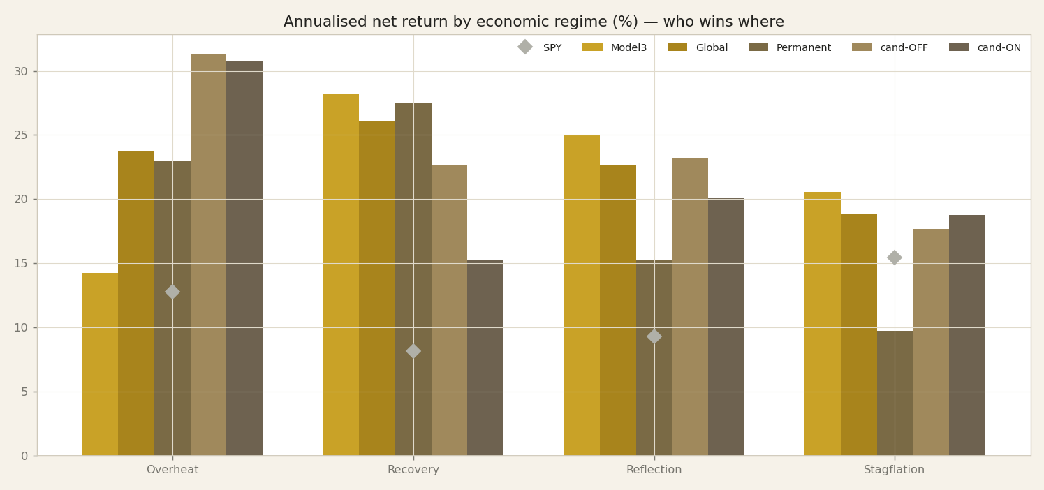
Here is the first headline result, and I want to state it plainly before we get carried away. On this chart we plot the annualised net return of each of our engines, split by economic regime. And the pattern is striking: every one of our engines beats the S&P 500 in every single regime. Let me anchor that against the benchmark. The S&P 500, which we track through SPY, returned twelve point eight percent a year in Overheat, eight point two percent in Recovery, nine point three percent in Reflation, and fifteen point four percent in Stagflation. Those are the bars our strategies sit above, across the board. Now, before anyone reaches for the champagne, I need to be honest about what this is and what it is not. Every number on this slide is in-sample. Our models were fit on this same history, and the regimes themselves were labelled after the fact, ex-post, from macro data. So this is not a forecast, and it is not a promise of future outperformance. It is a description of how these engines behaved on the data they learned from. Read the chart that way, and it becomes genuinely useful. What it tells us is not "we will always beat the market." What it tells us is the shape of each engine's personality: where each one leans in, where each one holds back, relative to a passive benchmark. That relative map is the durable takeaway, and it survives the in-sample caveat far better than any single return figure does. The heights of these bars will not repeat. The ordering, the character, is what we want you to carry forward. So keep this chart in mind, because the numbers behind it deserve a closer look. On the next slide we put the full detail on the table, engine by engine, regime by regime, so you can read the exact figures for yourself.
The return-by-regime matrix
Here is the full picture in one grid: each engine down the side, the four regimes across the top, and in every cell the annualised net return. Read it left to right and a personality jumps out. Model 3 posts fourteen-point-two percent in Overheat, twenty-eight-point-three in Recovery, twenty-five in Reflation, and twenty-point-six in Stagflation — it dislikes overheating but comes alive when growth rebounds. Global is the flat one: twenty-three-point-seven, twenty-six-point-one, twenty-two-point-six, eighteen-point-nine — steady across the board, no obvious weak spot. Permanent front-loads the good times — twenty-two-point-nine, twenty-seven-point-five — then fades to fifteen-point-two in Reflation and just nine-point-seven in Stagflation. The candidates are the sprinters in Overheat: cand-OFF at thirty-one-point-three, cand-ON at thirty-point-eight, but cand-ON then sags to fifteen-point-two in Recovery. And SPY, our benchmark, sits underneath almost everywhere: twelve-point-eight, eight-point-two, nine-point-three, and fifteen-point-four. Now, the honesty. Every number here is in-sample. The models were fit on this same history, and the regimes were labelled after the fact from FRED macro data. Reflation fills nearly half the sample; Stagflation is only about eleven percent, so that column is thin and its numbers are noisy — do not over-read a single decimal there. What survives the caveats is not the absolute size of any cell. It is the shape across the row: who leans into recoveries, who stays flat, who front-loads, who sprints then stalls. That relative map of temperaments is the durable finding. Hold it in mind, because in the next slide we take these same rows and read the SPY comparison honestly — because beating the benchmark in every regime is a claim that deserves scrutiny, not a victory lap.
Reading who-wins-where
So let's actually read the matrix we just put up, because the numbers tell a story once you group them. Start with Overheat — the regime where both growth and inflation are running hot. Here the two candidate engines dominate: candidate-OFF returns 31.3 and candidate-ON 30.8. That is a clear cyclical tilt — when the economy is genuinely hot, the candidates lean into risk and it pays. Now shift to Recovery, where growth is turning up but inflation is still contained. The leaders change: Model3 delivers 28.3 and Permanent 27.5. A different pair steps forward. Then Reflation — and remember, this is by far our dominant regime, roughly half of the whole sample, so it carries the most weight. Here Model3 is the strongest of the trio at 25.0. And finally Stagflation, the hard case — weak growth, sticky inflation. Model3 holds up at 20.6, while Permanent is the weakest at 9.7. So Permanent, which led in Recovery, is exactly the one that struggles when the environment turns ugly. Step back and a pattern emerges. Model3 never wins the biggest single number, but it is never absent from the top — strong in Recovery, strongest of the trio in Reflation, and still standing in Stagflation. That is the profile of an all-weather generalist. The candidates, by contrast, are cyclical specialists: they win big precisely when conditions are hot, and they are not built to carry the defensive regimes. Two honest reminders before we go on. All of this is in-sample — the models were fit on this same history, and the regimes were labelled after the fact from macro data. And Stagflation is thin, only about eleven percent of the sample, so that 20.6 is noisier than the Reflation figure. The durable lesson is not any single return; it is the relative personality — generalist versus specialist. Next we ask the harder question: who defends when the market actually crashes.
Beating SPY everywhere — read it honestly
So here is the headline you might expect us to celebrate: in this sample, every engine beats SPY in every regime. All four regimes, all our engines, ahead of the index. If we stopped there, you would rightly be suspicious — and you should be.
Let us read this honestly, because how we read it matters more than the numbers themselves. Two things are true at once. First, these models were fit on this same history. Second, the regimes were labelled after the fact, ex-post, from FRED macro data — we drew the boundaries once we already knew what happened. Put those together and you have the textbook recipe for an optimistic result. This is in-sample. It is a description of how our engines behaved on the data they learned from, not a forecast of how they will behave on money that is live tomorrow.
So the absolute outperformance — the "we beat the index everywhere" number — is the part I trust least. I would not underwrite a single euro on the promise that this margin survives out-of-sample. Magnitudes shrink when the future stops cooperating.
What I do trust is the relative shape. Which engine leans cyclical and feasts when growth and inflation run together. Which engine turns defensive and gives ground slowly when conditions sour. Which one is closest to all-weather, boring in the best way. That personality map is the informative signal here, because personalities travel better out-of-sample than magnitudes do. A model's character — where it is strong, where it is fragile — tends to persist even when its exact edge erodes.
So take the beats-everywhere line as reassurance that nothing is broken, not as a promise of free money. Hold the ranking, discount the levels. And keep that distinction in mind, because next we stop asking who wins and start asking a harder question: who defends when the market falls apart.
Who defends in a crash
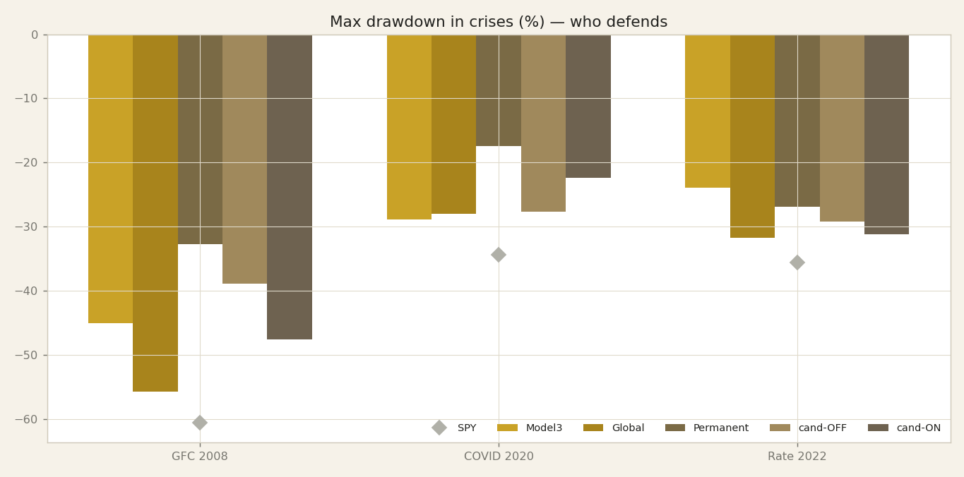
So far we've been looking at who wins when the economy is expanding. Now let's flip the picture over and look at the mirror image: who defends when things break. This chart shows the maximum drawdown — the worst peak-to-trough fall — of each engine through the three big stress tests of our sample: the Global Financial Crisis of 2008, the COVID crash of 2020, and the rate-shock selloff of 2022.
The first thing to say, plainly, is the bar on the far side every time: SPY. The broad market fell hardest in all three crises — down about sixty-one percent in 2008, thirty-four in 2020, thirty-six in 2022. Our engines each dug a shallower hole than the market in every one. But keep the honesty from the last slide in mind: this is in-sample, so read the relative shape, not the exact depth.
And here's the point I want you to take from this slide. The engine that fell the deepest in the calm expansions is not the engine that protects you in a crash. They are, in fact, different engines. Notice how the ranking reshuffles: whoever was leading the charge in Overheat is not the one hugging the top of this chart. The aggressive, high-upside temperament that wins in a growth boom is the same temperament that breaks harder when the market cracks. And the quiet, decorrelated engine that gave up return in the calm, disinflationary stretch — that's the one sitting at the shallowest end here.
So drawdown is the price tag on the returns we just admired. Over the next few slides we'll put exact numbers on that trade — the full drawdown matrix, then the single engine that defends best, and the ones that pay for their upside with the deepest holes.
The crisis-drawdown matrix
If the last slide asked who defends in a crash, this table gives the numbers. We took our three real crises — the Global Financial Crisis of 2008, the COVID shock of 2020, and the rate-hike drawdown of 2022 — and measured maximum drawdown, the worst peak-to-trough loss each engine suffered inside each episode. Read down the columns. In 2008, Permanent lost 32.7 percent, the mildest of the group. Model3 lost 45.1, our candidate defensive off variant 38.9, the candidate on variant 47.6, Global 55.7 — and SPY, the market itself, fell 60.6. In COVID 2020, Permanent again defends best at 17.4 percent, the candidate on at 22.4, the off variant 27.7, Global 28.0, Model3 28.9, against SPY at 34.3. In the 2022 rate shock the ranking shifts: Model3 defends best at 23.9, Permanent 26.9, then 29.3, 31.1, and 31.7 for Global, while SPY drops 35.6. The headline is clean: every engine beat SPY in every crisis. But hold the honesty we set out with. These drawdowns are in-sample — the models were fit on this same history, and the crisis windows are labelled after the fact from macro data. Three episodes is three data points; do not read the second decimal as destiny. What is durable here is the shape, not the digits. Permanent is the reliable shock-absorber across two of three crises; Model3 is the one that handles a rate-driven selloff best; Global takes the deepest hits but still undercuts the index. That ordering — the personality, the relative defence — is the signal worth carrying. Next we zoom into that best defender, Permanent, and ask what inside it produces this resilience.
The defender: Permanent
Let's meet the anchor of the whole line-up: the engine we call Permanent. Every number I'm about to give you is in-sample — these are our own models fit on this history, and the regimes were labelled after the fact from FRED macro data. So read this as a personality, not a promise.
Here is what makes Permanent the defender. Its correlation to the S&P 500 is 0.54 — by a wide margin the most decorrelated engine we run. When we line it up beside the equity market, it simply doesn't move in lockstep. And that shows up exactly where it matters. In the Global Financial Crisis, Permanent's drawdown was minus 32.7 percent, against the S&P 500's minus 60.6. In the COVID crash, it fell just 17.4 percent. When the market halves, this engine loses a third — or less. That is the definition of an anchor.
But — and this is the honest part — you do not get that defence for free. You pay for it. And you pay for it in the good times. Permanent posts the weakest returns of any engine in Stagflation, at 9.7 percent, and the weakest in Reflation too, at 15.2 percent. Reflation, remember from earlier, is where we spend roughly half our history — so this is the price you're paying most of the time. The very thing that keeps Permanent calm when markets fall — its low correlation, its refusal to chase — is what caps its upside when markets are quietly climbing.
So hold both truths at once. Permanent is the engine you want in the room when things break, and the engine you'll quietly resent when things are calm. That tension is not a flaw to fix — it's the trade we'll build around. Next, let's meet the other side of that trade: the attackers.
The attackers: Global & the candidates
If Permanent is the defender, this slide profiles the other temperament: the attackers. Start with Global. Global is our high-beta engine. Its correlation with the market is 0.73, so it moves closely with equities, only more so. That has two faces. When markets break, Global takes the deepest hole of any of our engines: in the Global Financial Crisis its drawdown reached minus 55.7 percent. But when the cycle turns up, Global leads. It posts 26.1 percent in Recovery, the best of the group when the economy is climbing out of a trough, and it stays strong in Overheat at 23.7 percent. You buy the recovery leadership by accepting the deeper crash. The candidate engines share this pro-growth tilt, but concentrated even more tightly in one regime: they lead Overheat, returning roughly 30 to 31 percent when growth and inflation are both running hot. That is a cyclical personality. These engines want the economy expanding; they earn most when the cycle is heating up, and they suffer most when it snaps. So the pattern for the whole aggressive side is symmetric: more upside when the economy expands, deeper holes when it breaks. That is the exact opposite temperament to Permanent, which gave up upside to stay shallow in the crash. Keep two honesty flags in mind. These are in-sample figures: the models were fit on this same history, and the regimes were labelled after the fact from macro data. And Overheat and the thinner regimes are sampled less often, so those leadership numbers carry more noise than the headline suggests. The durable lesson is the shape of the character, not the decimal. On the next slide we put all these personalities on one map so you can see them side by side.
The character map
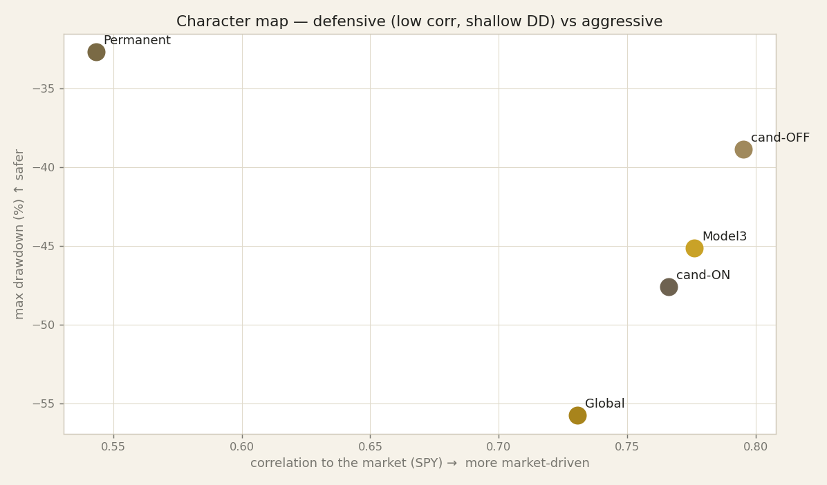
Let's put the whole cast on a single picture. Two axes. Along the bottom: how market-driven each engine is — its correlation to SPY. The further right, the more it simply moves with the broad market. Up the side: the depth of its worst drawdown, its deepest peak-to-trough fall. The lower down the chart, the shallower the pain. So read the corners. Bottom-left is the good-behaviour corner: decorrelated from the market and shallow drawdowns. Top-right is the aggressive corner: moves like the market and takes the deep falls with it. Now place our five. Permanent sits down in the bottom-left — low correlation to SPY, the shallowest worst-case loss of the group. That is the defender we met two slides ago, drawn as a single point. Global sits up in the top-right — high correlation, the deepest drawdown. That is the attacker: it earns its returns by being market-like and paying for it when the market falls. And the candidate we've been calling cand-OFF lands in the most attractive spot — toward that lower, better-behaved corner, giving the best risk-adjusted trade-off of the five: it keeps much of the upside without inheriting the full depth of the fall. One chart, five personalities, laid out by temperament rather than by headline return. Now the honest reminder, and it matters here more than anywhere: every point on this map is in-sample. The models were fit on this same history, and the regimes were labelled after the fact from macro data. So don't read exact coordinates — read positions relative to each other. The durable claim is the shape of the map: defenders in one corner, attackers in another, and a balanced candidate in between. That geometry — who lives where, and how far apart they sit — is what we carry into the behavioural fingerprint on the next slide.
Behavioural fingerprint
If the character map showed you the shapes, this table gives you the numbers behind them — one row per engine, seven columns. Read it as a fingerprint, not a scoreboard. Start with our two candidate variants. Candidate-off is the best risk-adjusted engine here: a Calmar of 0.61 — that is annual return divided by the worst drawdown, so return per unit of deepest pain — and a Sharpe of 1.09, the highest in the table. Its twin, candidate-on, trades some of that away: Sharpe 0.94, Calmar 0.43. Same family, different temperament. Now the research trio. Model3 posts the top Sharpe of the three at 0.98 and a 23.5 percent CAGR, but it pays with a 45 percent drawdown. Global is the aggressive cousin — 23.2 percent return, but the deepest hole of all, minus 55.7 percent, which is why its Calmar is only 0.42. Permanent earns the best Calmar of the research trio, 0.57, not by returning more — it returns the least, 18.6 percent — but by falling the least, only minus 32.7 percent. Two honest caveats. First, correlation-to-SPY: every engine sits between 0.54 and 0.80, so none of these is a market-neutral hedge; they are all long-equity strategies with different tilts. Second, and I have said it every slide: these numbers are in-sample. The models were fit on this same history, and the best- and worst-regime labels lean on regimes we barely sampled. Do not read Global's stagflation weakness as precise; read it as direction. What survives out-of-sample is the relative fingerprint — who is the defender, who is the attacker, who is balanced. That map is what we carry into the next slide, where the weaknesses stop overlapping.
Complementarity — the weaknesses do not overlap
Here is the structural point that makes this whole episode matter. Our engines do outperform, but that is not the durable lesson. The durable lesson is where they fail. They fail in different places. Look at Global. Its deepest hole is the Global Financial Crisis, a drawdown of minus fifty-five point seven percent. That is exactly the regime where Permanent is shallowest, at minus thirty-two point seven. Now flip it. Permanent gives up return in Stagflation, the growth-down, inflation-up regime, precisely where Model3 keeps compounding, at plus twenty point six. So one engine's worst environment is another engine's comfort zone. This matters because of a distinction we have to keep clean. Their returns are correlated. They are all long-risk strategies, so on a good day they tend to rise together and on a bad day they tend to fall together. But their mistakes are less correlated. The specific places where each one breaks do not line up. That gap, the lower correlation of errors, is the raw material of diversification. If two engines failed in the same regime, holding both would just double your exposure to that one weakness. Here they do not. When Global is bleeding in a credit crisis, Permanent is only lightly wounded. When Permanent stalls in stagflation, Model3 is still working. Let me repeat the honest caveat one more time. Every one of these numbers is in-sample. The models were fit on this history, and the regimes were labelled after the fact from macro data. Stagflation in particular is thin, so treat that plus twenty point six as directional, not precise. The reliable signal is the shape: complementary weaknesses, not overlapping ones. That is what tells us these engines belong together, and it is exactly the argument we build on next.
Why this argues for combining engines
So let's pull the thread together. We've watched each engine reveal a personality: Permanent defends when the world breaks, Global and the candidate attackers press their advantage when growth and inflation align in their favour. And here is the honest problem that follows from all of it: we cannot know the next regime in advance. Nobody rings a bell to tell us Reflation is ending and Stagflation is beginning. We only labelled these four regimes after the fact, from the FRED macro data. Live, we are always guessing.
That single admission is the whole investment case for combining engines. If each model protects in one regime and attacks in another, and if we genuinely don't know which regime is coming, then betting the whole portfolio on one engine means betting on one forecast we can't make. The alternative is to hold complementary personalities together. When we blend engines whose weaknesses don't overlap, the drawdowns don't arrive at the same moment. One engine is bleeding while another is holding the line. The result is a portfolio drawdown shallower than any single engine on its own, for a broadly similar return. That is the prize: a smoother ride, not a smaller destination.
I want to be precise about what this is. This is diversification across ENGINES, not just across assets. It is the quant argument for a meta-blend — a portfolio of models — rather than a wager on the one model we happen to like today. And I want to keep us honest: everything behind this is in-sample, and the thin regimes like Stagflation, only about eleven percent of our history, are noisy. So we are not promising the blend wins everywhere. We are saying its shape is more robust to our own ignorance about the future.
We'll quantify that blend properly in a later episode. For now, hold the intuition: complementary engines, shallower drawdown, similar return.
The personality map survives; the exact numbers do not
So let us close where honesty demands we close: on the caveats. Three of them, stated plainly. First, every per-regime number you have seen tonight is in-sample. Our models were fit on this exact history, and the regimes themselves were labelled after the fact, from FRED macro data we already had in hand. That combination flatters the results. The absolute outperformance — beating SPY in each regime — is almost certainly optimistic, because the models had the luxury of learning on the same road they were then tested on. Treat those margins as a ceiling, not a forecast. Second, the sample is lopsided. Reflation fills roughly forty-nine percent of the history; Stagflation is thin, just eleven percent. So some cells in our matrices rest on very few observations. A striking Stagflation number is not a law of nature — it is a small sample, and small samples are noisy. Read the thin regimes with a wide margin of doubt. Third, regime labels are a lens, not the territory. They help us organise the past into four legible states, but the next regime need not resemble any of them. History rhymes; it does not repeat on cue. So what actually survives all three caveats? Not the exact percentages — those will drift. What survives is the relative personality map: Permanent defends, Global attacks, and their weaknesses do not overlap. That structure is the durable finding, and it is why combining engines is the honest conclusion rather than crowning a single winner. Next episode, we turn to the force that quietly taxes all of this — the one line no Italian backtest can ignore. The twenty-six percent capital-gains tax, and what it does to every number we have just admired. Thank you.